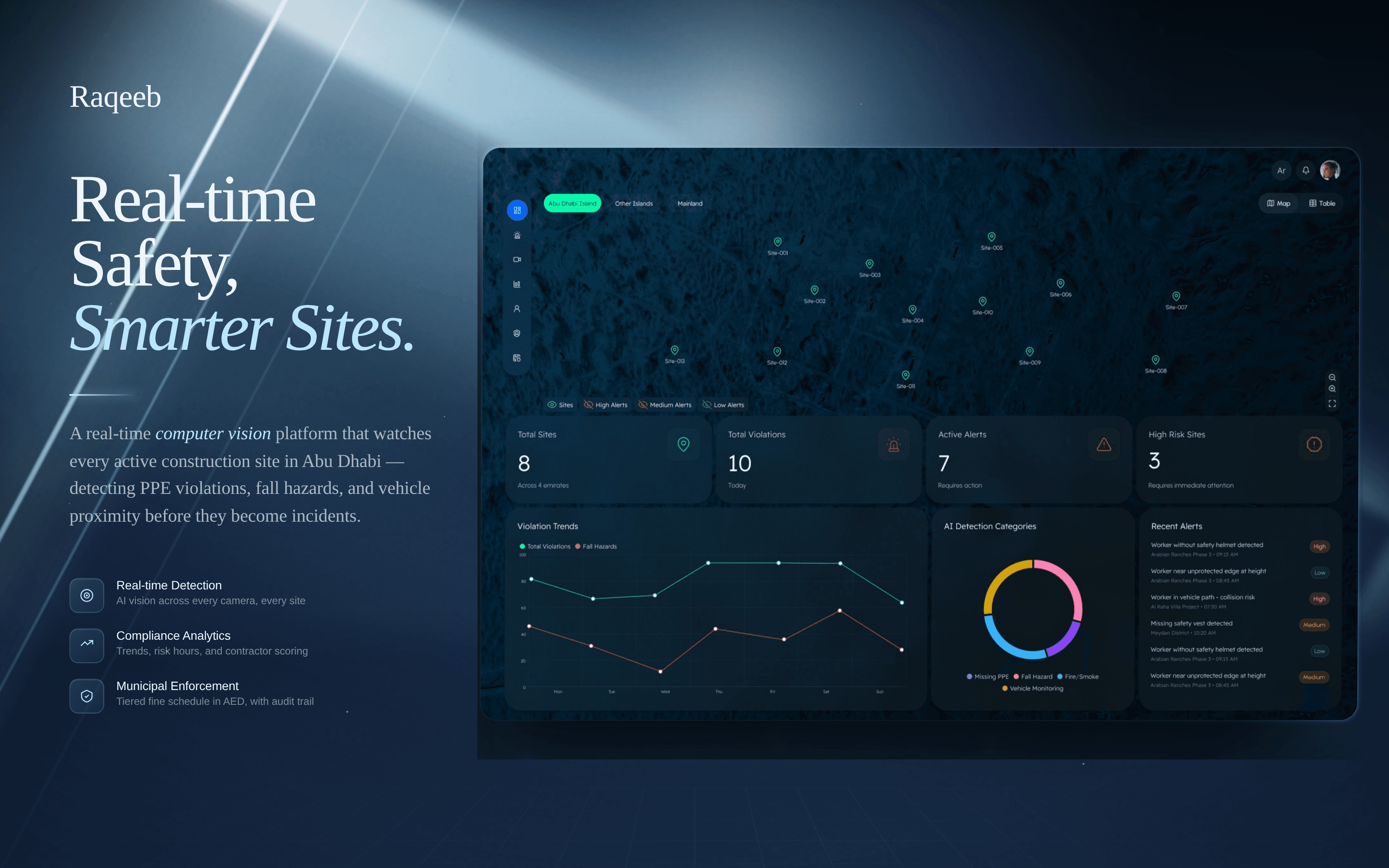
Raqeeb
Designing a real-time HSE monitoring system for construction sites
" Raqeeb , a large-scale monitoring system designed to give safety and operations teams full situational awareness, with alerts that actually matter. "
Client
Role
Industry
Date
The problem
Construction safety monitoring relied heavily on manual inspection.
Site inspectors and supervisors were responsible for identifying missing PPE, unsafe behavior, fall hazards, and environmental risks across active construction sites. But visibility was limited to where people could physically be, and response times depended on how quickly incidents were noticed and escalated.
At the same time, sites were already covered with surveillance cameras.
The challenge wasn’t lack of data. It was the inability to monitor and act on that data at scale.
A typical scenario looked like this :
A worker enters a restricted zone without a helmet, or a fall hazard emerges on-site , but the issue isn’t identified until someone notices it manually and reports it.
By then, the delay has already introduced operational risk.
The gap wasn’t monitoring. It was real-time awareness and prioritization.

The Solution
I approached the product as a monitoring and decision-support system rather than a traditional dashboard.
The core design challenge was balancing three things simultaneously:
Real-time visibility
Alert prioritization
Operational clarity under pressure
Early concepts explored dense monitoring layouts with multiple simultaneous feeds and alert-heavy interfaces. While technically informative, they quickly became overwhelming during reviews.
The problem wasn’t access to information.
It was helping users focus on what actually required attention.
That led to a different direction.
Instead of treating every event equally, I designed the experience around prioritized awareness , surfacing the highest-risk incidents first, while keeping the broader operational landscape visible in the background.
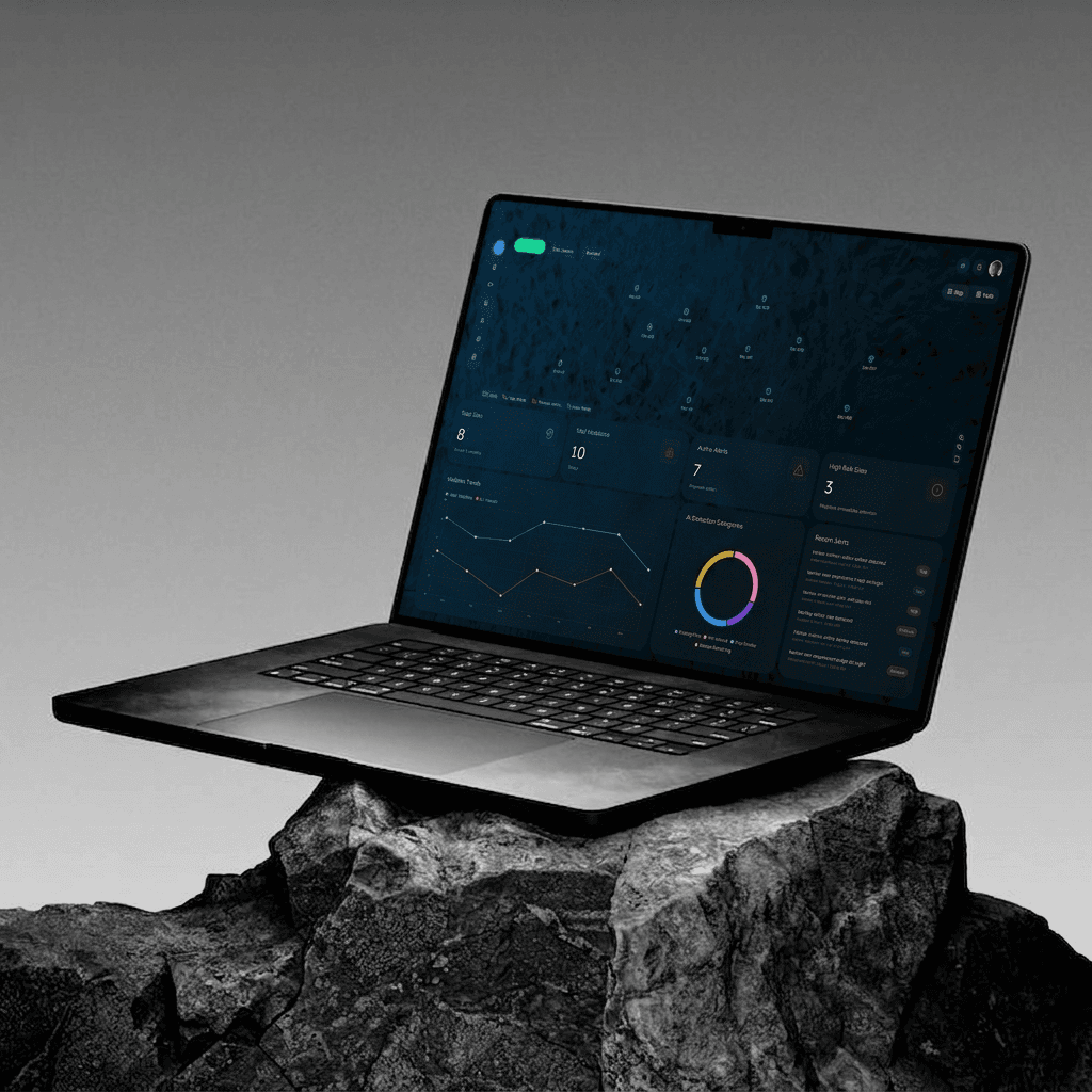
1. Geographic Monitoring Layer : Understanding site activity
The landing experience was designed around a live geographic overview of construction activity across multiple regions.
Rather than opening directly into alerts or tables, the system starts with spatial awareness , helping supervisors immediately understand where attention is needed.
Sites, risk levels, and violations are surfaced directly on the map to create a faster operational overview.
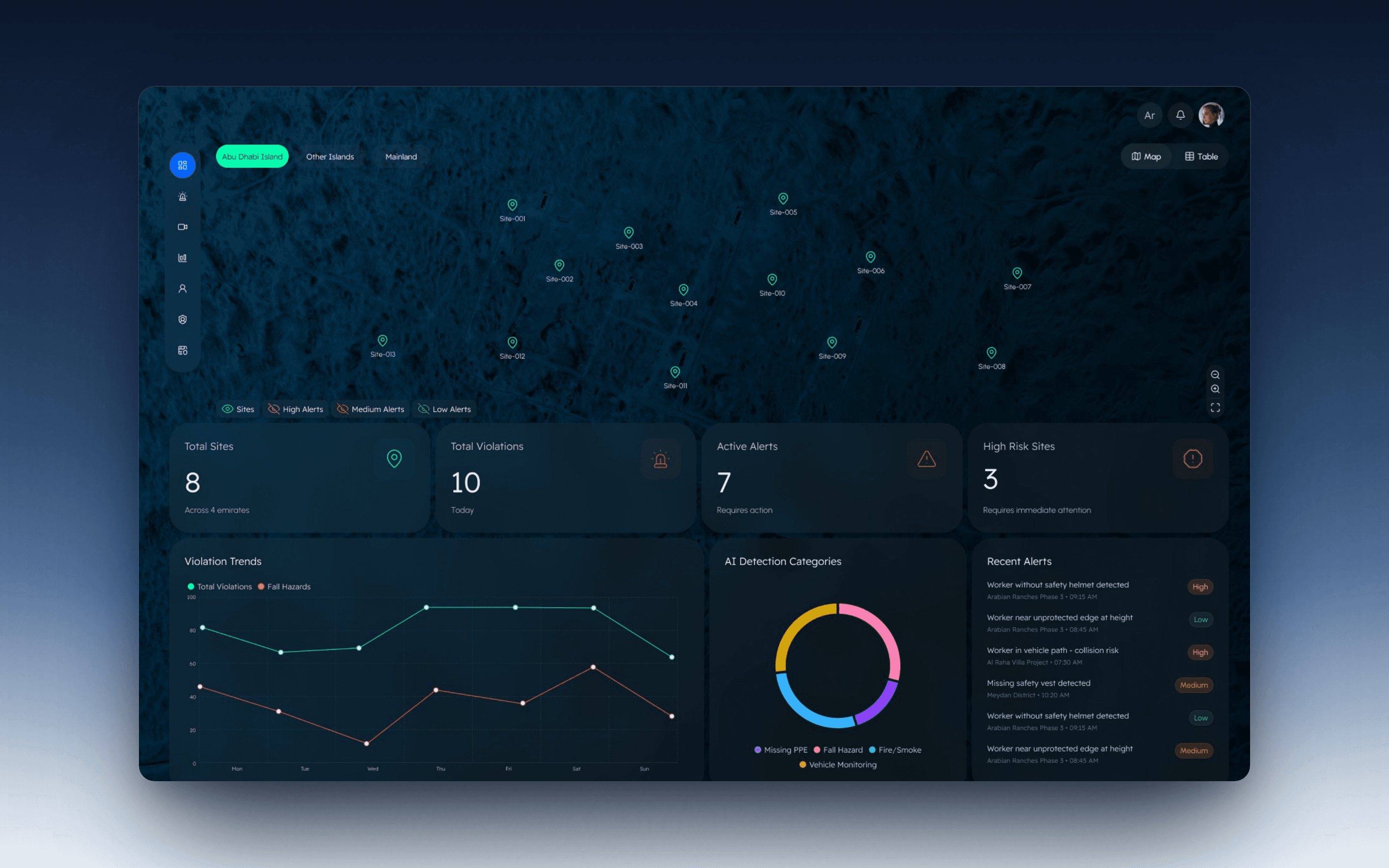
2. Alert Prioritization : Reducing operational noise
One of the biggest UX challenges was handling alert fatigue. Early explorations surfaced too many simultaneous notifications, making it difficult for operators to distinguish critical incidents from lower-priority events.
To solve this, I designed a layered prioritization system :
High-risk alerts remain persistent and visually dominant
Medium and low-priority events stay accessible without interrupting workflow
Detection categories provide fast contextual filtering
The goal was to reduce cognitive overload while maintaining situational awareness.

3. AI Detection Visibility : Making monitoring understandable
AI systems often fail when users cannot understand why something was flagged.
To build trust, the platform surfaces detection categories clearly : including PPE violations, fall hazards, fire/smoke events, and vehicle monitoring.
Instead of presenting AI as a black box, the system communicates what was detected and how incidents are categorized.
This created a monitoring experience that felt operational rather than experimental.

What was difficult
The hardest challenge wasn’t detection accuracy , it was designing clarity at scale.
When too much information appeared simultaneously, operators became slower, not faster. The interface needed to communicate urgency without creating panic or visual overload.
A second challenge was balancing visibility with simplicity. Safety systems naturally generate large amounts of operational data, but exposing everything equally reduced usability. The final solution relied heavily on prioritization, visual hierarchy, and progressive disclosure.
Another important challenge was trust. False alerts reduced confidence quickly, so the interface had to communicate severity and detection context clearly enough for operators to assess situations rapidly.
Key Takeaways
Designing for urgency is different from designing for engagement
In operational systems, clarity matters more than visual density. The interface has to support fast decisions under pressure.
AI alone doesn’t solve monitoring problems
Detection only becomes useful when paired with prioritization, visibility, and operational context.
Real-time systems require restraint
Showing everything at once creates noise. The real design challenge is deciding what deserves attention first.
Operational trust comes from clarity
Users adopt monitoring systems when alerts feel understandable, actionable, and reliable.
Projects